For about a month, I’ve been improving a set of scirpts to calculate statistics on the Qt Project. What I wanted to know, at first, was how well I was doing, how much I was contributing. Another question I had in mind and I know many others did too was “how much is the Qt Project dependent on Nokia?”
First it started with a simple “|wc -l” depending on whose statistics I wanted to get. This week, I decided to make graphs, so I spent a great deal of time learning gnuplot instead of doing other work. I’ll blog about the script itself on my next blog.
The statistics are online now. You can see it at http://macieira.org/blog/qt-stats. And come back every week, as it will update itself every Sunday to Monday evening.
Let me just point out the overall graph:

As you can see from the graph, the commit rate for the Qt Project was at its lowest during two days-off periods: New Years (week 52 of last year and week 1 of this year) and Easter (week 14). Aside from the first week of the project’s existence, it’s constantly been over 400 commits a week, and over 600 commits for 6 of the past 8 weeks. That’s impressive!
And answering the question of how much the project depends on Nokia, take a look at this other one:
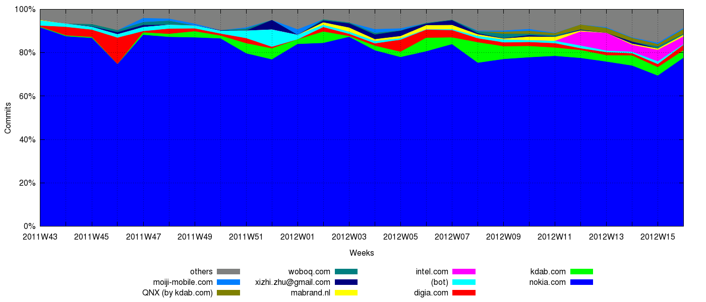
You can see that the participation from Nokia developers still is quite high (and will probably remain so), at around 80%. But in turn that means around 20% of the commits going to the Qt Project come from other people, employed by other companies or in their free time, and this less than 6 months after the official launch of the Qt Project.
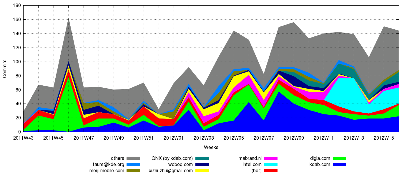
More than that, note the trend: Nokia’s participation tends to diminish, not because they’re doing less, but because others are doing more. The following graph, with Nokia’s numbers removed, shows the trend participation from others:
11 comments
jen
April 27, 2012 at 22:34 UTC (UTC 0)
http://macieira.org/~thiago/qt-stats/current/qtbase-full-no-nokia.employer.relative.png
^– lol, the left part looks more like a Picasso painting than like a graph. Maybe try more fine-grained resolution (per-day instead of per-week) to get a smoother graph?
Troy Unrau
April 27, 2012 at 22:35 UTC (UTC 0)
This proves once again what we already knew. David is a machine.
Thiago Macieira
April 27, 2012 at 22:59 UTC (UTC 0)
@jen: personally, I thought it looked more like a Dali painting than a Picasso
I’ve tried to do it per day, but I have discarded the results. There’s a very distinct periodicity: weeks. I’ve also tried to do a 7-day moving average, but the results weren’t satisfactory: it didn’t get us more information than we already had.
Romain
April 27, 2012 at 23:53 UTC (UTC 0)
Thanks for those Thiago!
From those plots we can tell exactly when your employer signed the CLA
Personally I’m glad to see the ratio nokia/others decreasing, and I’ll be really happy the day we reach 50% Nokia and 50% others.
@Troy: lol
Cheers
Romain
Thiago Macieira
April 28, 2012 at 08:45 UTC (UTC 0)
@Romain: I’m also looking for that day, but I’d like to make sure it happens while the absolute number of contributions from Nokia also increases.
Ian Monroe
April 28, 2012 at 12:29 UTC (UTC 0)
LOL @ dfaure getting his own color.
sebsauer
April 28, 2012 at 14:54 UTC (UTC 0)
Thanks. Indeed interesting numbers
Just for completness:
http://www.ohloh.net/p/qt/analyses/latest
Liang Qi
April 28, 2012 at 20:30 UTC (UTC 0)
Hi, Thiago,
xizhi.zhu@gmail.com is also an employee of Nokia, maybe he had done those changes in his spare time.
Thiago Macieira
April 30, 2012 at 10:19 UTC (UTC 0)
I know he is, but since he’s not using his Nokia email, I couldn’t decide whether his changes are copyright Nokia or not.
Laszlo Papp
May 2, 2012 at 12:09 UTC (UTC 0)
Nice graphs!
Do these graphs also imply the Playground projects or without those ?
Thiago Macieira
May 7, 2012 at 05:22 UTC (UTC 0)
No, that includes only Qt 4 (qt.git), Qt 5 (qt5.git & submodules) and Qt Creator (qt-creator.git)